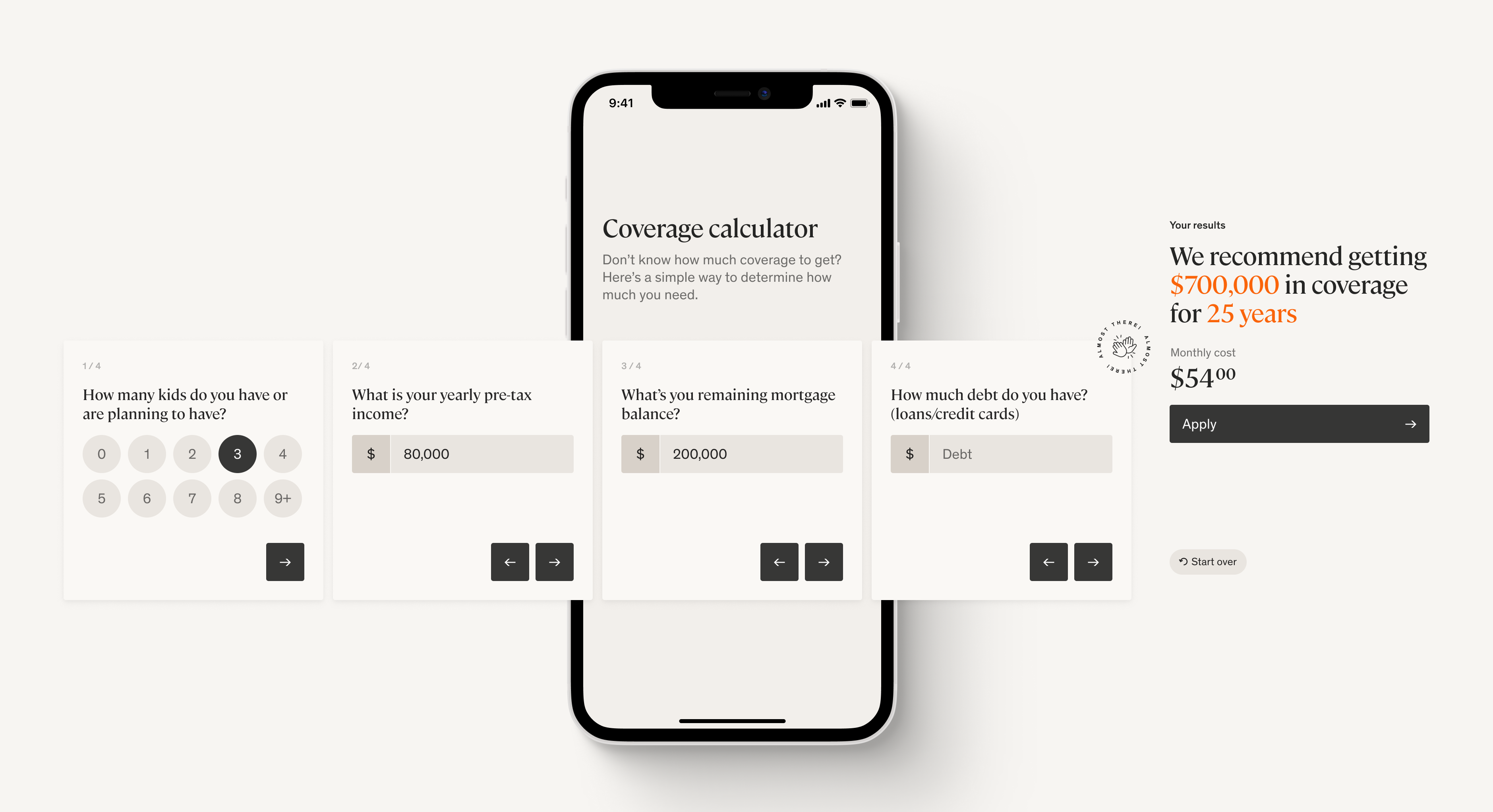
San Francisco 12:06


Converting at 37%, the package select page was by far the largest drop-off point in our funnel. Therefore, our goal for this project was to make a step function improvement in conversion and ultimately grow application submissions. In order to effectively address the core issues, we decided to investigate the low conversion numbers from a holistic view of the purchasing journey.
Research
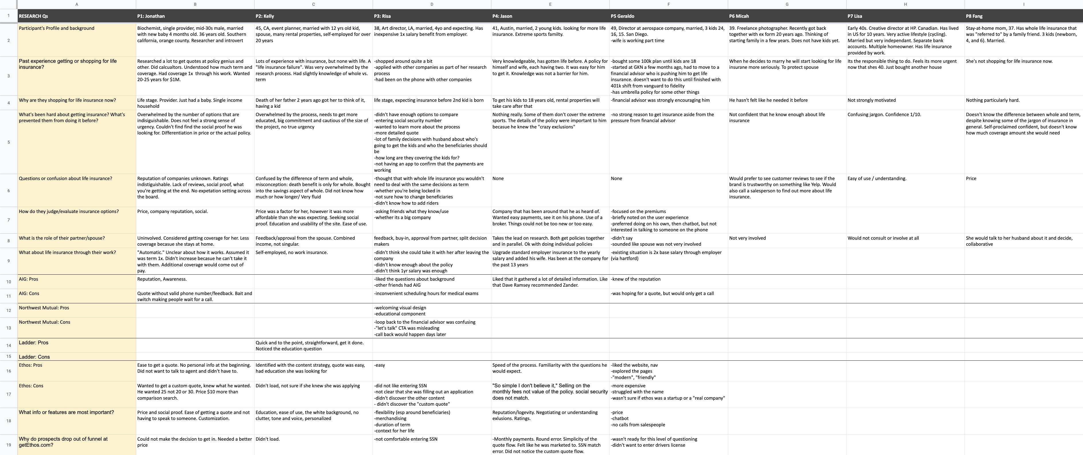
In collaboration with GV Research, our design team conducted a series of remote interview sessions with people who represented our core demographics. We were curious about what circumstances led to their need to shop for life insurance, and if they had purchased life insurance already, what their experiences were like. We walked participants through competitor product pages, as well as our own, to understand how the shopping experience for each matched the participants’ expectations. We learned that:- Price is a primary determining factor, so customers like to quickly find out how much a policy might cost to compare with other providers.
- Visitors with varying intent levels were searching for different types of information. For instance, a person new to shopping for life insurance was more interested in general information about what a policy would cover while a person with high intent sought out the details of a specific company’s process in regards to medical exams.
- Many participants expressed hesitation in what kind of policy made sense for their particular financial situation.
- Specific to the Ethos package select page, participants found our content aimed at high intent users, alienating those who were still early in their shopping journey. Because they were still shopping around, it felt like a big commitment to start the application right away.
- Our overly simplified process made some users question the legitimacy of our product.
- Because we didn’t have the same cache as some of the other more established providers, participants looked for social proof to validate our offering.
Exploration
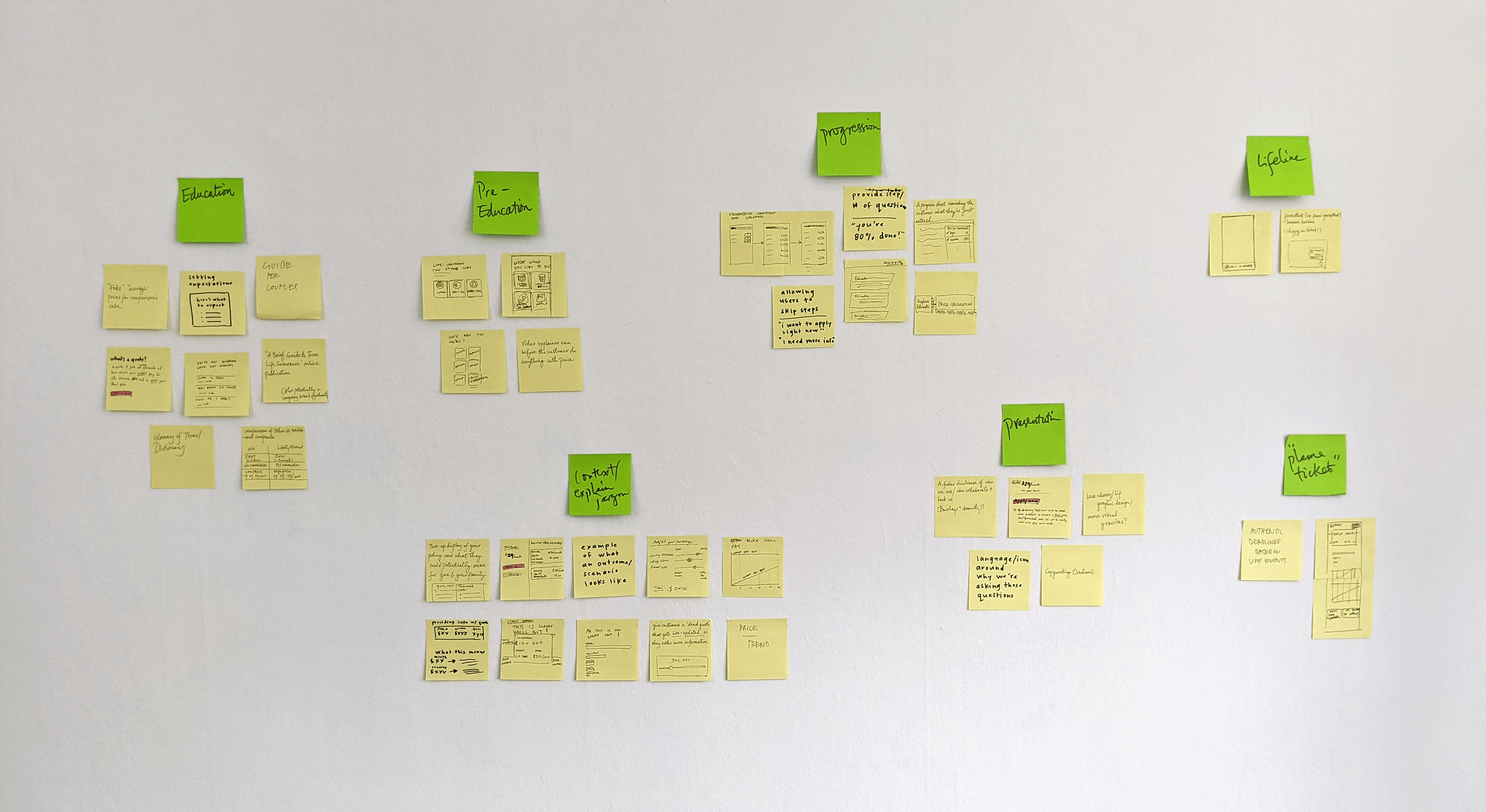
Using our learnings as a starting point, the design team came together to brainstorm concepts that could address the main user problems:- How might we help customers understand how much coverage they need?
- How might we provide customers more insight into their purchasing journey?
- How might we make customers feel confident in their decision?
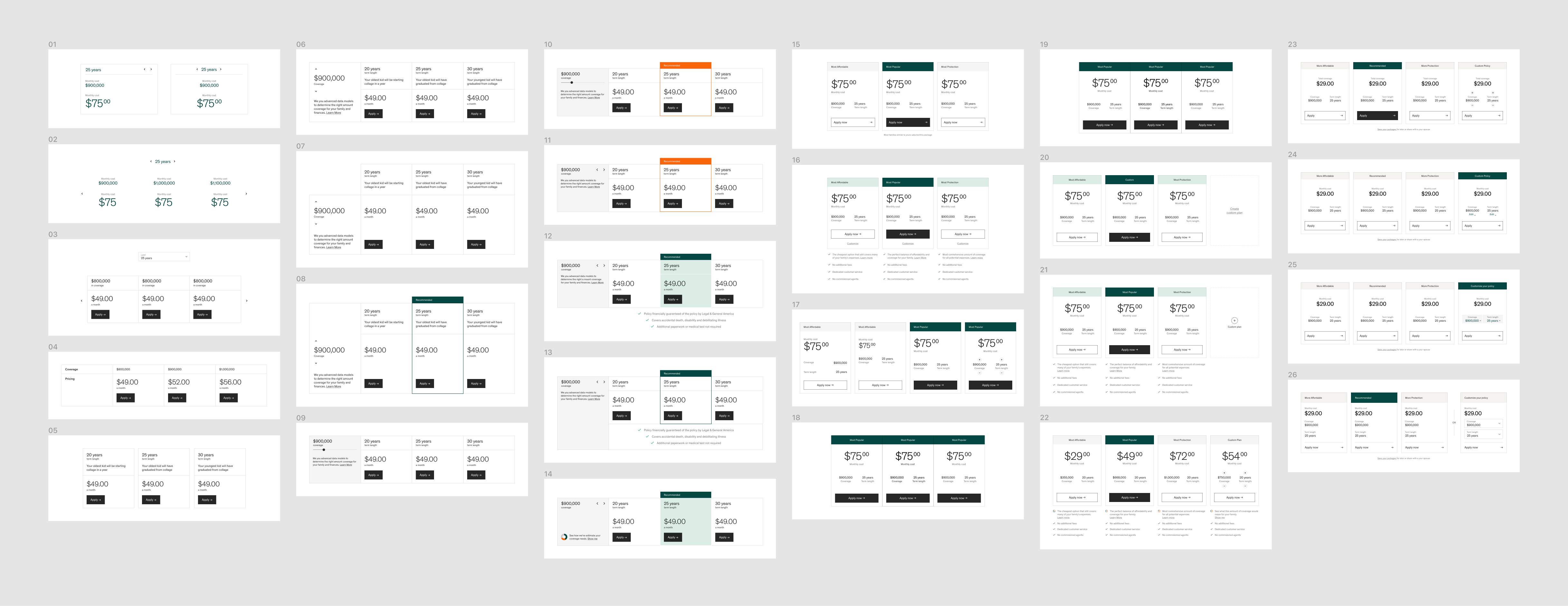
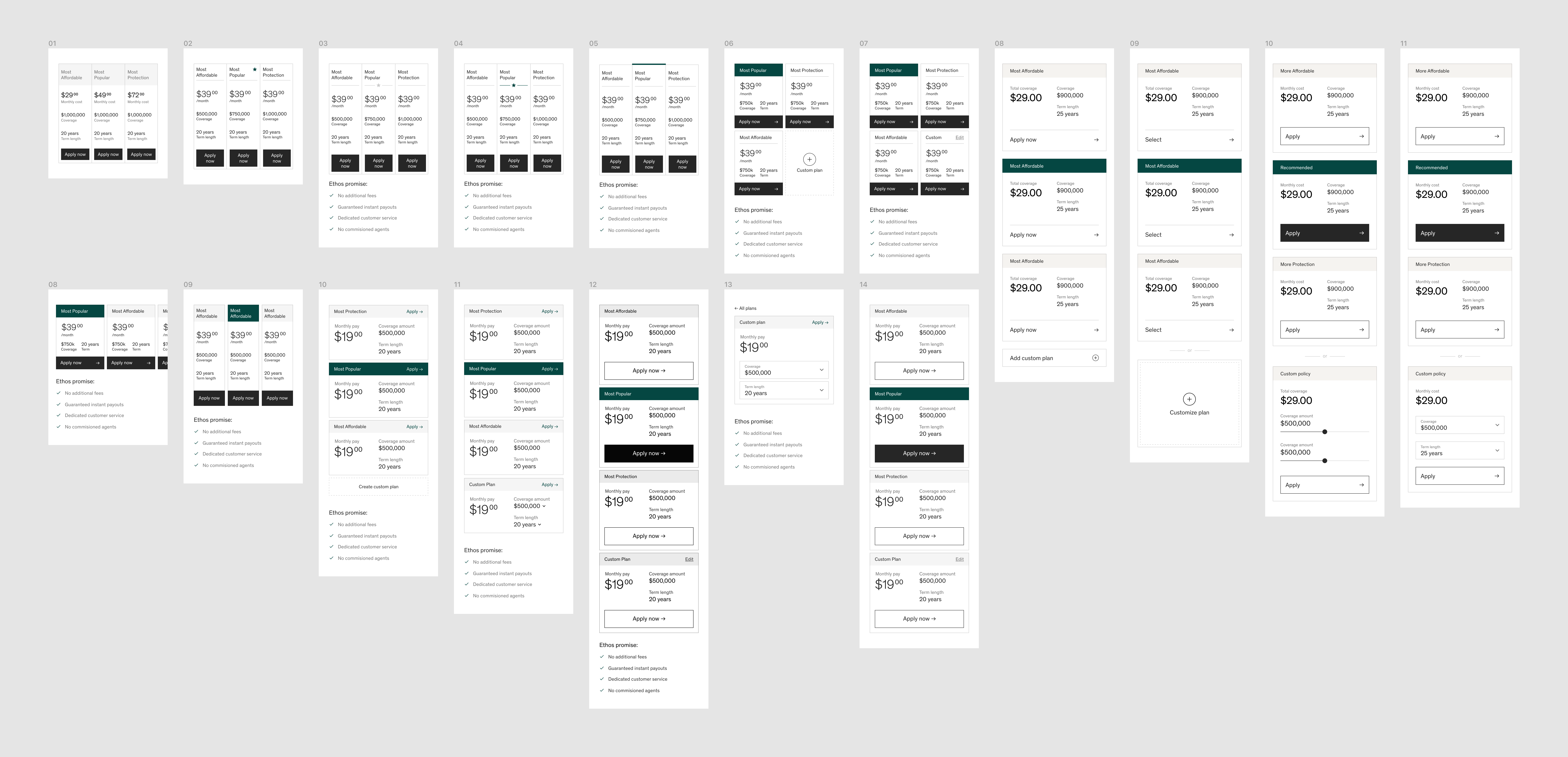
The brainstorm generated a variety of ideas, ranging from a sample policy from a fictional family to the ability to share quotes with others. With the goal of increasing conversion in mind, I narrowed down the list to the ideas that I felt best suited the package select page. From there, I worked with stakeholders to understand which concepts would create the most impact and tell a cohesive narrative. After determining the essence of the design, I iterated on each component to create a final recommendation that would satisfy user needs, functional needs, and business needs.

