San Francisco 12:06


Challenges
The main challenge of this project was the overwhelming amount of information and number of features throughout the product. In order to get a full understanding of the scope of the product we needed to first determine what features were still missing as well as identify opportunities where we could potentially remove or simplify existing features. We needed to work closely with the sales team to continuously iterate and refine the scope of the product.
After coming to an agreement on the scope of the product, our second challenge was to provide a simplified, consistent and ultimately faster user experience. We needed to organize the information and features into a logical hierarchy that would allow the sales team to quickly review and make modifications to the quote. In order to find the right structure, we needed to go through multiple rounds of prototyping and testing with the sales team.

Solutions
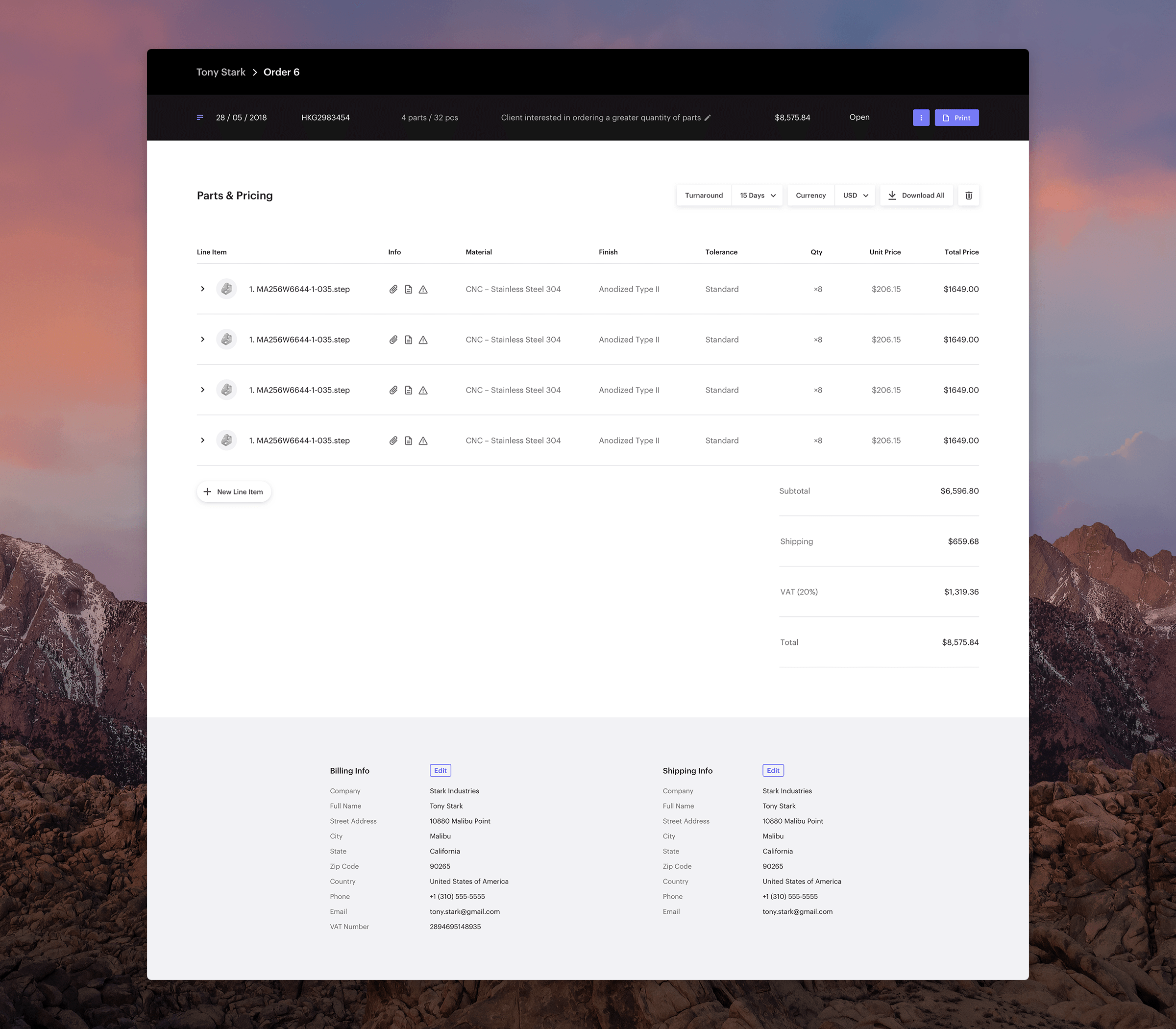
We began by redesigning the quote level details into a header component where the sales staff can quickly get an overview of the current quote version they are editing, navigate between versions, and perform quote level actions such as print, lock, duplicate etc. To help with their sporadic workflow we added the ability for them to add a note and keep tabs on different quote version as well as the ability to perform quote level action on multiple quotes without having to go into each one individually. Finally, by introducing the concept of an order, which exists a level above a quote, we made it much easier to for the sales staff to navigate and find exactly what they are looking for.
The second component that we addressed was the part and line items. We designed the line items and editing cards in such a way that they were easy to read despite the amount of information presented, and consistent regardless of what technology or combination of specifications were selected. In their static mode the line items neatly show the specification of the parts as well as indicate the additional details with a set off easily identifiable icons. We organized the details of a part into compact editing card that takes the place of a line item and allows the user to quickly modify they details without having to move around the screen. It was important to ensure that this component was as fast and seamless as possible, because of how frequently they would be interacting with it.
